Heads. Up.
Algoma University is about to flood your world with a tsunami of full-stop punctuation glyphs.
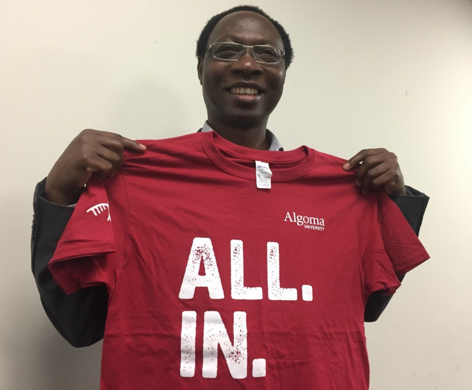
Clever word pairs, drenched in a torrent of periods, will feature prominently in a major re-branding campaign to be launched by Algoma University on Friday.
"The core of the messaging is using word pairings to try to get a point across, to try to be a little clever and to try to have some fun," Brent Krmpotich, director of marketing, communications and student recruitment, told a meeting of the school's board of governors tonight.
The following are some of the over-punctuated word pairings you're going to be seeing on billboards, brochures, bus shelters and online advertisements. They're designed to emphasize what makes Algoma University unique:
- Add. On.
- All. In.
- Soo. Much.
- Heritage. Honoured.
- Real. Impact.
- Proudly. Unique.
- Build. Up.
- Meet. Greet.
- New. Science.
- Wisdom. Shared
- All. Welcome.
- Thunderbirds. Rule.
- Suite. View. (referring to student residences)
- Even. More.
Krmpotich said the campaign was seven months in the making and involved consultations with students and faculty.
He added that "everything that you will see coming out publicly" will be based on the following positioning statement:
For students looking for a post-secondary education that encourages, supports and guides them in creating their own unique direction for the future, Algoma University is a welcoming community with values based on the Anishinaabe traditions of honesty, respect and wisdom. It's the university that provides value-based dynamic learning experience with research opportunities, a diverse engaged student body and relevant academic programs using a tone and manner that are open, student-focussed and socially conscious.
"We have not changed the university colours," Krmpotich said. "But we are introducing some different colours into the marketing pieces that we're putting out, to catch peoples' attention and to add a little bit of vibrancy and energy to the campaign."
Cathy Denomme, chair of business administration, described the word pairings as "powerful" but urged that "all of us have to work really hard to make those come true."
"We have to live it," she said. "Right now we have a queer community that I don't think would say that we're living it. We have to be really encompassing when we say 'All. Welcome.' We all have to be welcoming, everybody. I think that's something that we need to be working on."
Krmpotich said that the university has recently made heavy use of digital media but will add publications including Maclean's, the Toronto Star, Now magazine, as well as video ads during Cineplex pre-shows.